Graphs SAS: Ron Cody Book
SAS is a very powerful tool to build the graphs.
Our main focus is to build the SAS/Graph like Bar Graphs, Scatter Plots etc.Let us look on some of the questions and try to understand the code and the output.
The appearance of the output from various SAS/GRAPH procedures can be influenced by
additional statements such as SYMBOL (for example, defines plotting symbols and line
styles), PATTERN (defines styles for bar graphs), and AXIS (defines horizontal and
vertical axes)
Q1)

Code:

let us understand step wise what is happening
1) Title statement describes the title to be printed. It is a global statement.
2) Ron Cody has specified:
A PATTERN statement requests that the bars in your vertical bar chart consist of an
outline only (the default is to fill in the bar).
The VBAR statement requests a vertical bar
Alternatives to VBAR are as follows:
HBAR Horizontal bar chart
VBAR3D Three-dimensional vertical bar chart
HBAR3D Three-dimensional horizontal bar chart
PIE Pie chart
PIE3D Three-dimensional pie chart
DONUT Donut chart
STAR Star chart
Here the bars in the graph will be empty
3) GChart helps in building the graph from data A15035.Bicycles.
4)VBAR: Verticle Bar for Country and Model variables
For 2nd question
we want to build the pie chart changed the option to pie3d with the gchart option
Output1:


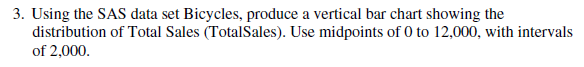
Q3)


Explanation:
1) Title "Distribution of total sales" is printed in the output window
2) Pattern value empty as mentioned above means the bar graphs are blank.
3)proc gchart helps in building the graph from data bicycles stored in the permanant library A15035
4)VBAR means verticle bar for total sales where range of x axis is from 0 to 12000 with the difference of 2000

The pattern of question is similar to the earlier question:
As per Ron Cody Book:
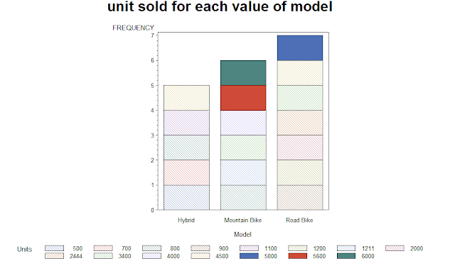
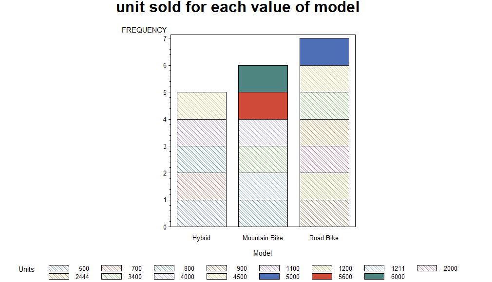
There are two ways to add another variable to the chart. The first way is to use a
GROUP= option in the VBAR statement.The other way to introduce another variable into the chart is to use the SUBGROUP= option. This option uses different patterns within each bar to represent a value of another variable
Pattern Statement:

q8-9)


Ploc gplot is a god tool to explore scatter plot. One can use plot option along to draw graphs between y and x.
You can add an interpolation option to the SYMBOL statement to request that the points
be joined or that a straight or curved line be drawn.
Another interpolation option is INTERPOL=sm (stands for smooth). To save you the
trouble of sorting your data set, you can request INTERPOL=sms. The “s” added to the
SM option stands for sort. When you use this option, SAS connects the points in the
proper sorted order.
Learning:
The gchart and gplot gives simple options which helps in building the graphs in simple yet efficient manner
Further Read:
Please refer to Statistical Analysis By Ron Cody Book.

Comments
Post a Comment